Graphical portrayals of data relationships are of course ubiquitous in science. Because graphs heavily involve visual impressions, there are a number of issues to consider in order to not leave mistaken impressions (which is why I prefer tables over graphs, but I won’t get into that). A very important one involves the choice of scales, especially the use of logarithmic data transformations.
You have to be careful when looking at such graphs and I’ll illustrate some of the main problems using three graphs from each of three different example situations, with particular (but not exclusive) reference to time series data and trend interpretation. In all cases, I allow both axes to span only the range of the data used, no more or less. This avoids issues of appearances determined by choice of axis scale range, which are potentially important but not my focus here.
Example 1
Suppose one has a simple linear function, say Y = 0.1*X, with X ranging from 1 to 1001 and a sample size of 50 (blue dots in graphs), Y therefore ranging from 0.1 to 100.1. If time is graphed such that the reference point time = 0 is in the past, we have the basic linear graph:

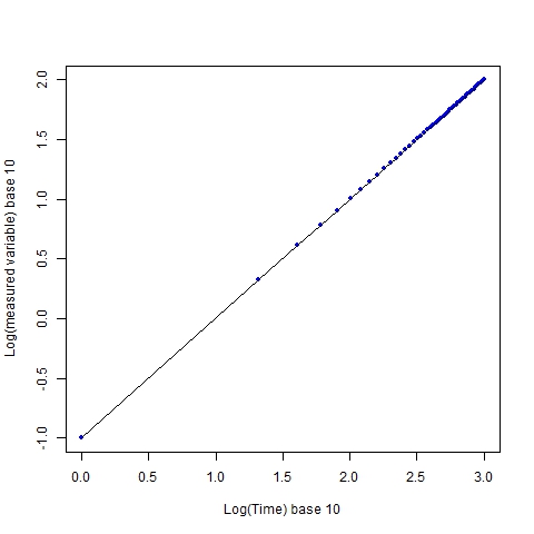
If we take logarithms of each axis, regardless of the base chosen (I use base 10), we still get linearity:
 The graph retains a visual linearity, and this is a prime reason why log transformations are done, i.e. to show relationships when several orders of magnitude are spanned by the data. However, the impression of the sampling coverage is no longer the same. The individual sampling points, which are evenly distributed (every 20 time units in the original scale), now appear to increasingly cluster as x increases.
The preceding is the best case scenario for logarithmic data transformations, in terms of their visual fidelity to the original relationship. But very often (too often) in the science literature, only one axis (often the x), not both, is transformed. Doing so will give this:
 Without an instinctive awareness of the effects of log transformation, the line shape here gives a strong visual distortion of the original data, one implying a strongly accelerating rate of increase in y with x, when we know that rate is in fact constant at 0.1.
Example 2
It is common in historical time series for the present time to be defined as time = 0, at the right end of the x axis, and the axis labeled in terms of “years ago”, for example:
 [I had to use negative values for time because of the way the R “plot” function handles things–it doesn’t allow increasing axis value labels moving from right to left]. This is identical to the first graph above except that time values now have a maximum, instead of a minimum, of zero. And that makes a difference; if I only transform the x axis, I get the following:
 [I negate the time values before computing the logarithms, since logarithms of negative numbers are undefined, then negate the resulting log values to accomodate R’s annoying graphing quirk.] Opposite of the third graph above, there now appears to be a very strong deceleration with time, approaching an asymptote. Now watch what happens if both variables are transformed:
 Unlike the first example, where transforming both axes returned a linear relationship, the distortion in this case gets even worse, now appearing something like a hyperbolic function.
Example 3
Lastly, I retain the convention of the x axis having reference time t=0 near the right end of the axis, but now use a periodically varying function, such as a simple sine function, y = sine(X*(pi/160)) + 1, again for 50 sample points, evenly spaced:

If I transform the x axis I get a distortion in which the frequency appears to decrease continually:
 And if I transform both axes, the distortion gets worse again:
 So, reversing the scale of the x axis, and then taking logarithms of both is about the worst possible decision one can make, in terms of an accurate visual representation of the relationship in the original units.
One final point. There is no stochasticity in these data, and the sampling interval is perfectly constant, which is to say, they are unrealistic for anything except modeled data. Deviation from those optimal conditions, which is guaranteed with real data, will decrease the ease of interpretation under log transformation, and potentially the accuracy, still more. In particular, if you fit a function to some data that has random error (i.e. pretty much any real data), then a log transform of that function will be biased. And almost all time series line graphs from real data are fits of some type to the data, including simple smoothing functions.
So log transformations of data are a potential hornet’s nest as far as graph interpretation goes. If you’re going to transform only one axis, you better have a real good reason for so doing, and explain it well. And if you’re going to designate time = 0 at the axis right end, you can forget about retaining the visual relationship present in the original data, unless you also reverse the direction of the y axis. And what is the point of that? Personally, I can’t think of one.
R code:
## Logarithmic transforms, examples of effects on graph appearance ##
# These can be considered best case scenarios in the sense that there's no stochastic variation or unequal sampling across time; i.e. the problems illustrated get worse with those things added
# Note: simply reversing the x axis to get time before present, using the "xlim" argument in the R "plot" function, will NOT work (it will automatically reverse the y axis with it); must create a new variable
# Used base 10 here but any base can be used, with same results

x = seq(from=1, to=1001, by=20); x.rev = -rev(x)
log.x = log(x,base=10); log.x.rev = -log(-x.rev,base=10)
y = 0.1*x; log.y = log(y,base=10); y.per = sin(x*pi/160) + 1

# Plots:
xlabl = c("Time", "Log(Time) base 10", "Time (present = 0)", "-Log(-Time), base 10")
ylabl = c("Measured variable", "Log(measured variable) base 10")

# set 1: time = 0 in the past
windows(); plot(x, y, pch=20,col="blue", xlab=xlabl[1], ylab=ylabl[1]); lines(x,y)
windows(); plot(log.x, log.y, pch=20,col="blue", xlab=xlabl[2], ylab=ylabl[2], xlim=c(0,max(log.x))); lines(log.x,log.y)
windows(); plot(log.x, y, pch=20,col="blue", xlab=xlabl[2], ylab=ylabl[1], xlim=c(0,max(log.x))); lines(log.x,y)

# set 2: time = 0 at present
windows(); plot(x.rev, y, pch=20,col="blue", xlab=xlabl[1], ylab=ylabl[1]); lines(x.rev, y)
windows(); plot(log.x.rev, y, pch=20,col="blue", xlab=xlabl[4], ylab=ylabl[1]); lines(log.x.rev, y)
windows(); plot(log.x.rev, log.y, pch=20,col="blue", xlab=xlabl[4], ylab=ylabl[2]); lines(log.x.rev, log.y)

# set 3: periodic variation (sine function) and present time = 0
windows(); plot(x.rev,y.per,pch=20,col="blue", xlab=xlabl[1], ylab=ylabl[1]);lines(x.rev,y.per)
windows(); plot(log.x.rev, y.per, pch=20,col="blue", xlab=xlabl[4], ylab=ylabl[1]); lines(log.x.rev,y.per)
windows(); plot(log.x.rev, log(y.per,base=10), pch=20,col="blue", xlab=xlabl[4], ylab=ylabl[2]); lines(log.x.rev,log(y.per,base=10))
