Severe analytical problems in dendroclimatology, part fifteen

I’m going to give this topic another explanatory shot with some different graphics, because many still don’t grasp the serious problems inherent in trying to signal and noise from tree ring size. The most advanced method for attempting this is called Regional Curve Standardization, or RCS, in which ring size is averaged over a set of sampled trees, according to the rings’ biological age (i.e. ring number, counting from tree center), and then dividing each individual series by this average. I include five time series graphs, successively containing more information, to try to illustrate the problem. I don’t know that I can make it any clearer than this.

First, shown below are the hypothetical series of 11 trees sampled at a single sampling location.

Each black line shows the annual ring area progression for each of 11 trees having origin dates spaced exactly 10 years apart (the bold line is just the oldest tree of the group). By using ring area as the metric we automatically remove part of the non-climatic trend, which is the purely geometric (inverse quadratic) effect from each series. Any remaining variation is then entirely biological and it exhibits a very standard tree growth pattern, one in which growth rate increases to a maximum value reached relatively early life (here, around age 80 or so) and then declines more slowly toward a stable asymptote, which I fix at 1.0. Each tree’s trajectory occurs in a constant climate over the 300-400 year period measured.

The next figure adds two components:

First, the blue line represents a constantly increasing climatic parameter over time, say temperature, expressed as a ratio of its effect on ring size at year 0. Thus, at year 400, the cumulative climatic effect on ring area, regardless of biological age, is exactly 3-fold of its year zero value (scale at right). The second addition is the series of red lines, which simply represent those same 11 trees’ growth trajectories growing under this climate trend. The climatic effect on growth is a super simple linear ramp in all cases–I am not invoking any kind of problematic, complex growth response (e.g. “divergence”), or any other complication. Thus, by definition, if we divide the two corresponding ring series for each tree, we get exactly the blue line, in all cases.

In the third figure:

I add a green line–this is the estimated RCS curve, computed the standard way (by aligning each tree according to its biological age and then averaging the ring sizes over all trees). This RCS curve is thus the estimated non-climatic ring size variation, which we accordingly remove from each tree by dividing the red growth series by it. Finally, we average the resulting 11 index series, over each of the 400 years, giving the stated goal: the estimated climatic time series.

It is at first glance entirely clear that the green RCS curve does not even come close to matching any of the black curves representing the true non-climatic variation…which it must. According to standard dendroclimatological practice we would now divide the 11 red curves by this green RCS curve–which is thereby guaranteed not to return the true climatic signal. So what will it return?

It returns the orange line shown above. No that’s not a mistake: it will return an estimated climatic trend of zero.

And this is the entire point–the supposedly most advanced tree ring detrending method is fully incapable of returning the real climatic trend when one exists. Note that I’m keeping everything very simple here–this result does not depend on: (1) either the direction or magnitude of the true trend, or (2) the magnitude, or shape, of the non-climatic trend in the sampled trees (including no such whatsoever). That is, this type or magnitude of result is not specific to the situation I set up. The problem can be reduced, but never eliminated, by increasing the variance in tree ages in the sample. But since standard field sampling practice is to sample the oldest possible trees at a site, this is very rare, a fact which the data of the International Tree Ring Database (ITRDB) shows clearly–which is ironic given that Keith Briffa and Ed Cook mentioned the importance of exactly this issue in a white paper available at the ITRDB site.

Lastly, suppose now that the last usable year for all ring series occurred a few decades ago. This will occur, for example, due to many ITRDB field samples being collected decades ago now, or for any perceived problems in the climate-to-ring response calibration function, which is must be stable and dependable (notably, the “divergence” effect, in which linear relationships between climate and ring size break down, badly). What will be the result of eliminating, say, the last five decades of data, and replace them with instrumental data? Well, you will then get exactly this:

Look familiar? Does that look like anything remotely approaching success to you? Again, I have not even broached other possibly confounding problems, such as co-varying growth determinants (e.g. increasing CO2- or N-fertilization, changing soil moistures, or inter-tree competition), nor non-linear responses in the calibration function, nor any of the thorny issues in large-scale sampling strategies, reconstructions and their corresponding data analysis methods. Those things would all exacerbate the problem, not improve it. It’s a total analytical mess–beginning and end of story.

I can’t make it any clearer than this. And yes I have the R code that generated these data if you want to see it.

Experts only

So, the IPCC has produced a special report on the issue of limiting the global temperature increase to 1.5 degrees C. This report is still open for comments for another 13 days…if you are an “expert” in the IPCC’s eyes. And what if you are not? Well if you’re American, you could still have commented, for a 30 day period that ended last week (Feb. 8), through a commenting system run by the United States Global Change Research Program (USGCRP)…assuming you actually knew about it.  And that latter issue is the topic of this post.

All IPCC report drafts are open to expert review, internationally, through a system the IPCC operates. In that system, you apply to be a reviewer by submitting your name and qualifications, which basically involves stating your expertise, including your degree and a list of up to five publications that demonstrate it. Then IPCC-associated folks say yes or no to your request.

But IPCC reports are also open to comments by national governments. The United States of course does so, the USGCRP administering this process.  But unlike the IPCC process, the USGCRP solicits comments from… anybody.  The notifications for these comment periods are required by law to be posted in the Federal Register, and the notice also appears on a USGCRP web page (corresponding links here and here; screenshots for the two below).
Fed Register

usgcrp2

At least for this report, the USGCRP also posted four Twitter notices, on January 16, 24, 29 and February 5, all identical.  Why they waited six days before the first notice I don’t know. Below is the Jan. 24 notice.

usgcrp1

You still have to register, but in that process you just select the category from a drop-down list that best describes your status, in one of five broad categories, screenshot below:
USGCRP Registration screen

I now encourage you to read the Federal Register notice linked to above. Notice exactly what it says. Specifically, even though the process is open to everyone, the entire notice, including the title (“Call for Expert Reviewers…”) is framed in the language of “expert” reviewer, the crux of which reads as follows:

As part of the U.S. Government Review, starting on 8 January 2018, experts wishing to contribute to the U.S. Government review are encouraged to register via the USGCRP Review and Comment System (https://review.globalchange.gov/?)… The USGCRP coordination office will compile U.S. expert comments and submit to the IPCC, on behalf of the Department of State, by the prescribed deadline. U.S. experts have the opportunity to submit properly formatted comments via the USGCRP Review and Comment System (https://review.globalchange.gov/?) from 8 January to 8 February 2018. To be considered for inclusion in the U.S. Government submission, comments must be received by 8 February 2018.

Experts may choose to provide comments directly through the IPCC’s Expert Review process, which occurs in parallel with the U.S. Government Review. Registration opened on 15 December 2017, and runs through 18 February 2018: https://www.ipcc.ch/?apps/?comments/?sr15/?sod/?register.php

The Government and Expert Review of the IPCC Special Report on Global Warming of 1.5 °C ends February 25, 2018.

Do you see any indication anywhere in any of it, that indicates that the commenting process is in fact open to the general citizens of the United States? I don’t. This is in fact only apparent when you actually go to the USGCRP Review and Comment page, and attempt to register, per the screen shot above. To say nothing of the fact that experts using the IPCC’s review system have 90 days to comment whereas those using the USGCRP’s have only 30.

OK, so then one day ~two weeks ago I was wasting my time and energy, which is to say I was reading Twitter comments, and I noticed a climate scientist, Katharine Hayhoe relay a message inviting “colleagues” to comment on the IPCC report (original comment here). In response, a climate activist, Steve Bloom, asked her directly (paraphrasing) “And what about people like me?”, meaning non-academics (and non-experts to the IPCC).

This conversation immediately went downhill, but the bottom line in this context is that Hayhoe either (1) had no idea that all Americans still had nearly another two weeks or so to comment on the report, or (2) she did know but didn’t tell him. I have no evidence for believing the latter, and so the logical conclusion is the former. I didn’t see the exchange until a few days later, but when I did I jumped in to alert everyone that yes indeed, any American citizen could still comment for another week or so. I also directly criticized Hayhoe for not knowing this, given that she was a lead author on a chapter of another report, the National Climate Assessment #4 that just went through the USGCRP review process. But after seeing how the USGCRP phrases their official notices (and Tweets) regarding their review process, I can surely see why she might not have known.

Hayhoe, who won the AGU’s “Climate Communication” award four years ago (with its $10,000 prize) made no response whatsoever to my comments—she simply blocked me on Twitter, meaning I can no longer read any of her comments there. No acknowledgement of the USGCRP process, no apology to Bloom, nothing. Her main comment in the process was to tell Bloom not to talk disrespectfully to climate scientists, adding that he’d been warned before, screen shot below.
Hayhoe Twitter comments
Steve Bloom–no, no response from him either. The only person to comment at all on what I said was Richard Betts, a UK climate scientist who stated that it was interesting to learn that the United States allowed all citizens to comment on IPCC reports. Maybe the United States, unlike the IPCC, understands that having something important to say, is not limited to “experts”, whatever the latter entails exactly. Volumes could be written on that topic alone, but that’s not for the here and now.

So, this is just one example of the kind of thing we’re dealing with in the whole climate change public outreach circus, or tragedy, whichever it is. But it’s one thing if it’s just an entertaining circus, and another thing altogether if your so-called “climate communicators” can’t communicate crucial facts about the public interaction process.

Recognition For Review

I just found out that the second annual Peer Review Week is well underway. There are several online articles on the topic, perhaps best found via Twitter searches using #RecognizeReview or #PeerRevWk16, or via links at the link above.

This year’s theme thereof is Recognition For Review, and in that context it’s perfect timing, relative to a peer review post that I already had in mind. I don’t think there’s any question that the peer review process as a whole has very major problems, ones which greatly weaken the clarity, efficiency and reliability of the scientific process. These problems originate largely in the design of the review process, which in turn affect review execution. However, this reality doesn’t preclude the fact that thousands of people perform excellent review work, daily. And they’re not getting much credit for it either.

Some attention then, to one of the most interesting, important–and puzzling–reviews I’ve ever seen. Occasionally a paper comes out which is worth paying intense attention to, for reasons that go beyond just its technical content, and this is surely one in my opinion. The review and paper in question are publicly available at Atmospheric Chemistry and Physics (ACP). This was a long, involved review on a long, involved paper. If you have limited time to devote to this, go read Peter Thorne’s ICARUS article, a summary of his overall review experience.

The journal is one of a set of European Geophysical Union (EGU) journals that have gone to a completely open review process. The commenting process is online and open to anyone, although two or more official reviewers are also designated by the editor, who (unlike volunteer reviewers) may remain anonymous if they choose. For this open process alone the EGU deserves major recognition and gratitude, as it is arguably the single biggest step that can be taken to improve the peer review process. Everything has to be open.

There is a lot to say on this and I’ll start with the puzzling aspect of it. The article in question’s lead author is James Hansen, arguably still the most famous climate scientist in the world. Several of the reviews show that the article’s main claims are quite contentious, relative to the evidence and analysis presented, as summarized most completely by Thorne’s two reviews, the second of which–a phenomenal piece of review work–also summarizes Hansen et al’s responses (and non-responses) to the numerous reviewer comments, a job which presumably should really have fallen to the editor.

I’ve not yet worked all the way through everything, but you can’t read it and not wonder about some things. The authors didn’t have to submit their paper to an open review journal. So why did they? Did they assume the claims of the paper were largely non-contentious and it would thus slide smoothly through review? But given the clearly important claims, why not then submit to a highly prominent journal like Science or Nature for maximum attention and effect? Maybe they did, had it rejected and this was the second or third submission–I don’t know.

A second issue, one of several that did not sit at all well with Thorne, was the fact that Hansen et al. notified members of the press before submission, some of whom Thorne points out then treated it as if it were in fact a new peer reviewed paper, which it surely was not. When confronted on this point, Hansen was completely unapologetic, saying he would do the same thing again if given the chance, and giving as his reason the great importance of the findings to the world at large, future generations in particular. What? That response pretty well answers the question regarding his confidence in the main conclusions of the paper, and is disturbing in more than one way.

Thorne was also not at all pleased with Hansen’s flippant and/or non-responses to some of the review comments, and for this he took him severely to task for his general attitude, especially given the major weaknesses of the paper. The most important of the latter was the fact that there was no actual, model connection between the proposed processes driving rapid ice sheet melt, and the amount of fresh water flowing into the oceans to drive the rapid sea level rise that is the main claim of the paper. Rather, that flow was prescribed independently of the ice melt processes in what amounted to a set of “what if” scenarios more or less independent of the model’s ice melt dynamics. More importantly, this highly important fact was not clear and prominent: it had to be dug out by careful reading, and moreover, Hansen essentially denied that this was in fact the case.

There are major lessons here regarding conduct of peer review, how scientists should behave (senior scientists in particular), and scientific methodology. Unfortunately, I have no more time to give this right now–and I would give it a LOT more if I did. This is thus largely a “make aware” post. The paper and its review comprise a case study in many respects, and requires a significant commitment. I personally have not seen a more important paper review in a very long time, if ever. Peter Thorne, some of the other volunteer reviewers, and ACP, deserve recognition for this work.

Please do not fire off any uninformed comments. Thanks.

Twitter science

Discussing science on the internet can be interesting at times, even on Twitter, which seems to have been designed specifically to foster misunderstanding by way of brevity. Here are two examples from my week.

Early in the week, Brian Brettschneider, a climatologist in Alaska, put up a global map of monthly precipitation variability:
Brettschneider map
Brian said the metric graphed constitutes the percentiles of a chi-square goodness-of-fit test comparing average monthly precipitation (P) against uniform monthly P. I then made the point that he might consider using the Poisson distribution of monthly P as the reference departure point instead, as this was the more correct expectation of the “no variation” situation. Brian responded that there was no knowledge, or expectation, regarding the dispersion of data, upon which to base such a decision. That response made me think a bit, and I then realized that I was thinking of the issue in terms of variation in whatever driving processes lead to precipitation measured at monthly scales, whereas Brian was thinking strictly in terms of the observations themselves–the data as they are, without assumptions. So, my suggestion was only “correct” if one is thinking about the issue the way I was. Then, yes, the Poisson distribution around the overall monthly mean, will describe the expected variation of a homogeneous, random process, sampled monthly. But Brian was right in that there is no necessary reason to assume, apriori, that this is in fact the process that generated the data in various locations.

The second interchange was more significant, and worrisome. Green Party candidate for President, physician Jill Stein, stated “12.3M Americans could lose their homes due to a sea level rise of 9ft by 2050. 100% renewable energy by 2030 isn’t a choice, it’s a must.” This was followed by criticisms, but not just by the expected group but also by some scientists and activists who are concerned about climate change. One of them, an academic paleoecologist, Jacquelyn Gill, stated “I’m a climate scientist and this exceeds even extreme estimates“, and later “This is NOT correct by even the most extreme estimates“. She later added some ad-hominem barbs such as “That wasn’t a scientist speaking, it was a lawyer” and “The point of Stein’s tweet was to court green voters with a cherry-picked figure“. And some other things that aren’t worth repeating really.

OK so what’s the problem here? Shouldn’t we be criticizing exaggerations of science claims when they appear in the mass culture? Sure, fine, to the extent that you are aware of them and have the time and expertise to do so. But that ain’t not really the point here, which is instead something different and more problematic IMO. Bit of a worm can in fact.

Steve Bloom has been following the climate change debate for (at least) several years, and works as hard to keep up on the science as any non-scientist I’ve seen. He saw Gill’s tweets and responded, that no, Stein’s statement did not really go so far beyond the extreme scientific estimates. He did not reference some poor or obsolete study by unknown authors from 25 years ago, but rather a long, wide ranging study by James Hansen and others, only a few months old, one that went through an impressive and unique open review process (Peter Thorne was one of the reviewers, and critical of several major aspects of the paper, final review here, and summary of overall review experience here). Their work does indeed place such a high rate of rise within the realm of defensible consideration, depending on glacier and ice sheet dynamics in Greenland and Antarctica, for which they incorporate into their modeling some recent findings on the issue. So, Jill Stein is not so off-the-wall in her comments after all, though she may have exaggerated slightly, and I don’t know where she got the “12.3M homes” figure.

The point is not that James Hansen is the infallible king of climate science, and therefore to be assumed correct. Hanson et al. might be right or they might be wrong, I don’t know. [If they’re right we’re in big trouble]. I wasn’t aware of the study until Steve’s tweeted link, and without question it will take some serious time and work to work through the thing, even just to understand what they claim and how they got there, which is all I can expect to achieve. If I get to it at all that is.

One point is that some weird process has developed, where all of a sudden a number of scientists sort of gang up on some politician or whatever who supposedly said some outrageous thing or other. It’s not scientist A criticizing public person B this week and then scientist C criticizing public person D the next week–it’s a rather predictable group all ganging up on one source, at once. To say the least, this is suspicious behavior, especially given the magnitude of the problems I see within science itself. I do wonder how much of this is driven by climate change “skeptics” complaining about the lack of criticisms of extreme statements in the past.

To me, the bigger problem is that these criticisms are rarely aimed at scientists, but rather at various public persons. Those people are not immune to criticism, far from it. But in many cases, and clearly in this one, things being claimed originate from scientists themselves, in publications, interviews or speeches. For the most part, people don’t just fabricate claims, they derive them from science sources (or what they consider to be such), though they certainly may exaggerate them. If you don’t think the idea of such a rapid rise is tenable, fine…then take Hanson et al. to the cleaners, not Jill Stein. But, unless you are intimately familiar with the several issues involving sea level rise rates, especially ice melt, then you’ve got some very long and serious work ahead of you before you’re in any position to do so. This stuff is not easy or simple and the authors are no beginners or lightweights.

The second issue involves the whole topic of consensus, which is a very weird phenomenon among certain climate scientists (not all, by any means). As expected, when I noted that Stein was indeed basically referencing Hanson et al., I was hit with the basic argument (paraphrased) “well they’re outside of the consensus (and/or IPCC) position, so the point remains”. Okay, aside from the issues of just exactly how this sacred consensus is to be defined anyway… yeah, let’s say they are outside of it, so what? The “consensus position” now takes authority over evidence and reasoning, modeling and statistics, newly acquired data etc., that is, over the set of tools we have for deciding which, of a various set of claims, is most likely correct? Good luck advancing science with that approach, and especially in cases where questionable or outright wrong studies have formed at least part of the basis of your consensus. It’s remarkably similar to Bayesian philosophy–they’re going to force the results from prior studies to be admitted as evidence, like it or not, independent of any assessment of their relative worth. Scientific ghoulash.

And yes, such cases do indeed exist, even now–I work on a couple of them in ecology, and the whole endeavor of trying to clarify issues and correct bad work can be utterly maddening when you have to deal with that basic mindset.

How not to do it

This is a long post. It analyzes a paper that recently appeared in Nature. It’s not highly technical but does get into some important analytical subtleties. I often don’t know where to start (or stop) with the critiques of science papers, or what good it will do anyway. But nobody ever really knows what good any given action will do, so here goes. The study topic involves climate change, but climate change is not the focus of either the study or this post. The issues are, rather, mainly ecological and statistical, set in a climate change situation. The study illustrates some serious, and diverse problems.

Before I get to it, a few points:

  1. The job of scientists, and science publishers, is to advance knowledge in a field
  2. The highest profile journals cover the widest range of topics. This gives them the largest and most varied readerships, and accordingly, the greatest responsibilities for getting things right, and for publishing things of the highest importance
  3. I criticize things because of the enormous deficit of critical commentary from scientists on published material, and the failures of peer review. The degree to which the scientific enterprise as a whole just ignores this issue is a very serious indictment upon it
  4. I do it here because I’ve already been down the road–twice in two high profile journals–of doing it through journals’ established procedures (i.e. the peer-reviewed “comment”); the investment of time and energy, given the returns, is just not worth it. I’m not wasting any more of my already limited time and energy playing by rules that don’t appear to me designed to actually resolve serious problems. Life, in the end, boils down to determining who you can and cannot trust and acting accordingly

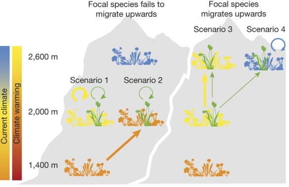
For those without access to the paper, here are the basics. It’s a transplant study, in which perennial plants are transplanted into new environments to see how they’ll perform. Such studies have, at least, a 100 year history, dating to genetic studies by Bateson, the Carnegie Institute, and others. In this case, the authors focused on four forbs (broad leaved, non-woody plants), occurring in mid-elevation mountain meadows in the Swiss Alps. They wanted to explore the effects of new plant community compositions and T change, alone and together, on three fitness indicators: survival rate, biomass, and fraction flowering. They attempted to simulate having either (1) entire plant communities, or (2) just the four target species, experience sudden temperature (T) increases, by moving them downslope 600 meters. [Of course, a real T change in a montane environment would move responsive taxa up slope, not down.] More specifically, they wanted to know whether competition with new plant taxa–in a new community assemblage–would make any observed effects of T increases worse, relative to those experienced under competition with species they currently co-occur with.

Their Figure 1 illustrates the strategy:

Figure 1: Scenarios for the competition experienced by a focal alpine plant following climate warming. If the focal plant species (green) fails to migrate, it competes either with its current community (yellow) that also fails to migrate (scenario 1) or, at the other extreme, with a novel community (orange) that has migrated upwards from lower elevation (scenario 2). If the focal species migrates upwards to track climate, it competes either with its current community that has also migrated (scenario 3) or, at the other extreme, with a novel community (blue) that has persisted (scenario 4).

Figure 1: Scenarios for the competition experienced by a focal alpine plant following climate warming.
If the focal plant species (green) fails to migrate, it competes either with its current community (yellow) that also fails to migrate (scenario 1) or, at the other extreme, with a novel community (orange) that has migrated upwards from lower elevation (scenario 2). If the focal species migrates upwards to track climate, it competes either with its current community that has also migrated (scenario 3) or, at the other extreme, with a novel community (blue) that has persisted (scenario 4).

Continue reading

Karl et al., once again

I’m just going to pick up here from the update posted at the top of the previous post. Read the previous two posts if you need the background on what I’m doing.

I was fortunately able to get the global mean annual values for NOAA’s ERSST version 4 data from Gavin [edit: this must actually be merged land and ocean, or MLOST, not ERSST data]. Here’s the same analysis I did previously, using those data. I also realized that the data at the NOAA web page included year-to-date value for 2015 (which so far is apparently record warm). I removed that year here. As before, no significance testing here, which is trickier than might appear, or that I have time for. (Note that Karl et al. did not test for significance either).

First, here’s a graph of the two time series (previous ERSST version = black, new data = blue). The graph appears to be identical, or nearly so, to Karl et al.’s Fig 1a:
ERSSTv4_2

This gets interesting here. Visually, there’s clearly little difference between the two series; their correlation is about 0.995. But…when I run the same analysis on the new data that I did on the previous version, the results (right-most two columns) are very different indeed:

   Start1 End1 Start2 End2  Slope1 Slope2  Ratio Previous
2    1911 1997   1998 2012 0.06933 0.0855 1.2332   0.4995
3    1911 1997   1998 2014 0.06933 0.1063 1.5325   0.8170
4    1911 1999   2000 2012 0.07252 0.0920 1.2685   0.5422
5    1911 1999   2000 2014 0.07252 0.1162 1.6018   0.9033
6    1931 1997   1998 2012 0.06517 0.0855 1.3120   0.5821
7    1931 1997   1998 2014 0.06517 0.1063 1.6305   0.9522
8    1931 1999   2000 2012 0.07071 0.0920 1.3011   0.5999
9    1931 1999   2000 2014 0.07071 0.1162 1.6430   0.9995
10   1951 1997   1998 2012 0.10488 0.0855 0.8152   0.3647
11   1951 1997   1998 2014 0.10488 0.1063 1.0131   0.5966
12   1951 1999   2000 2012 0.11211 0.0920 0.8206   0.3797
13   1951 1999   2000 2014 0.11211 0.1162 1.0363   0.6327
14   1971 1997   1998 2012 0.17069 0.0855 0.5009   0.2162
15   1971 1997   1998 2014 0.17069 0.1063 0.6225   0.3536
16   1971 1999   2000 2012 0.17887 0.0920 0.5143   0.2274
17   1971 1999   2000 2014 0.17887 0.1162 0.6495   0.3788

All of the ratios are now higher; that is, there is less of a difference in slope between the post- and pre-breakpoint time periods. This is regardless of start, break, or end years. Most of the ratios are now > 1.0; before, none of the them were so. For the 1951 start date emphasized the most by Karl et al., and ending in 2014, there is near equality in slopes, just as they state. If one ends instead at 2012, the recent interval is just over 80% of the earlier, much higher than using the previous version data, where it was 36-38%. Choice of start year has a large effect: the highest ratios arise using a 1931 start and the lowest from a 1971 start. A 1971 start date gives the largest discrepancy in rates among any of the four tested; there has clearly been a slowdown if one starts there, and there’s just as clearly been an increase if one starts from 1931. It washes out as a draw if one starts from 1951.

The only point of real contention now is the last sentence in the paper: “…based on our new analysis, the IPCC’s (1) statement of two years ago – that the global surface temperature “has shown a much smaller increasing linear trend over the past 15 years than over the past 30 to 60 years” – is no longer valid. Comparing a 30 to 60 year interval with a sub-interval of it, is not the proper comparison. You have to compare non-overlapping intervals, and if you start those from 1971, then yes there definitely has been a slowdown, based on these data.

What’s interesting–and unexpected–to me, is how such a very small difference in the two time series can have such a large impact on the ratio of warming rates in the two time periods. When I first graphed the above, my first thought was “nearly identical, not going to affect the rate ratios much at all”.

Wrong!

p.s. On the NOAA data issue–I noticed that one can in fact get version 4 data from NOAA, just not the spatio-temporally aggregated versions, which as mentioned, have incorrect links to the previous version. You have to be willing and able to do your own aggregating, but if you are, you can get both ASCII and NetCDF format, by month and grid cell.

Karl et al 2015, updated analysis

Update: As mentioned in the piece below, I had suspicions that the data at the NOAA ERSST v4 webpage were not the correct (version 4) data, and it turns out that this is in fact the case. I learned this after Gavin Schmidt of NASA forwarded me data he had been sent directly from NOAA personnel. So, I need to do the analysis below again with the version 4 data, when I get time. Needless to say, NOAA needs to put correct data on their web pages, especially when it forms the basis of a paper making this magnitude of a claim. It’s also telling, and depressing, that of the large number of scientists commenting on this paper, none had apparently gone to get the actual data with which to check Karl et al’s analysis. If they had, they’d have noticed the discrepancy against what Karl et al report.
End Update

And the situation’s worse than I had first thought. Unfortunately.

As I mentioned in the update to previous post, Gavin Schmidt of NASA brought to my attention on Twitter the fact that you cannot average trend rates obtained via Ordinary Least Squares (OLS), between two consecutive time periods, and assume that value will equal the trend computed over the combined periods. I was confused by this at first, but Gavin made a plot showing exactly what the issue is:
OLS trend averaging Nothing forces the two trend lines to be continuous at the junction of the two intervals, and a big jump or drop in the data at or near that junction, with suitably short sample sizes, will cause this to happen. A slight variation of this is just what I did in comparing trend rates over the time intervals that Karl et al discussed. I did so because they did not include the rates, in their Table S1, for all of the intervals they discussed, so I had to make algebraic estimates. [Note that Table S1 is in fact a big problem, as it gives a hodgepodge of time periods that do not in fact allow one to make a direct and clear comparison of rates between consecutive time intervals, the very point of the paper. And their Figure 1 and discussion do not help.]

So, here I compute and report the OLS-derived trend estimates for Karl et al.’s variously defined intervals, and some others they didn’t discuss, using the new NOAA data directly. These intervals are defined by: (1) four start dates (1911, 1931, 1951, 1971), (2) two breakpoint years (1998 and 2000), and two end years (2012 and 2014); this creates 16 possible pairs of time intervals. For each I compute the OLS-derived trend (degrees C per decade) for the two consecutive intervals, and the ratio between them, as the second (“slowdown”) over the first (pre-“slowdown”). [Note that the mismatch issue arises because an OLS-derived straight line is the “stiffest” possible model one can fit to a time series. Using something more flexible like lowess or a polynomial model, would lessen this problem, but then you run into other issues. Since OLS is “BLUE” (Best Linear Unbiased Estimator), and minimizes the possibility of over-fitting the data (very important here!), and since Karl et al used it, I stick with it here. Also, I am only presenting data on the trend estimates themselves, not on their probabilities relative to a null, or any other possible, model. Doing that is trickier and more time consuming than people might think, time I don’t have right now.]

First, the new NOAA annual GMST data, from 1880 on, look like this:
ERSSTv4

Second, the trend analysis results:

   Start1 End1 Start2 End2 Slope1 Slope2 Ratio
2    1911 1997   1998 2012 0.0685 0.0342 0.499
3    1911 1997   1998 2014 0.0685 0.0560 0.817
4    1911 1999   2000 2012 0.0719 0.0390 0.542
5    1911 1999   2000 2014 0.0719 0.0649 0.903
6    1931 1997   1998 2012 0.0588 0.0342 0.582
7    1931 1997   1998 2014 0.0588 0.0560 0.952
8    1931 1999   2000 2012 0.0650 0.0390 0.600
9    1931 1999   2000 2014 0.0650 0.0649 1.000
10   1951 1997   1998 2012 0.0938 0.0342 0.365
11   1951 1997   1998 2014 0.0938 0.0560 0.597
12   1951 1999   2000 2012 0.1026 0.0390 0.380
13   1951 1999   2000 2014 0.1026 0.0649 0.633
14   1971 1997   1998 2012 0.1584 0.0342 0.216
15   1971 1997   1998 2014 0.1584 0.0560 0.354
16   1971 1999   2000 2012 0.1714 0.0390 0.227
17   1971 1999   2000 2014 0.1714 0.0649 0.379

The table shows several important results. First, there is only one case in which the slope of the slowdown period is as large as that of the pre-slowdown period, given by the eighth row of the table (start = 1931, break = 2000, end = 2014). In two other cases the ratio exceeds 0.90 (rows 5 and 7) and in one more case it exceeds 0.8 (row 3). For the 1951 start date most emphasized by Karl (rows 10-13), no ratio higher than 0.63 results, no matter how the intervals are defined. The mean and median of the 16 ratios are both about 0.56, so there’s no skew issue.

If one’s goal is to compare the data against the trends and discussions given in the AR5, that is, to assess the effects of the bias reductions in the new NOAA data on possible rate changes, then 2012 is of course the end year to use. For the two possible break years, those ratios are given in rows 10 and 12, as 0.365 and 0.380 respectively: the “slowdown” interval rates are thus ~ 35 to 40 percent of the pre-slowdown rates. In the previous post, in which I had to estimate the trend rate in the first interval algebraically, I got estimates of about 65-68%. So…the problem’s actually worse than I first estimated, and by quite a bit, 35-40% instead of 65-68%. And there are some serious discrepancies in my trend values vs theirs. For example, Karl et al report the trend from 2000 to 2014 as 0.116; I get 0.0649. For 1998-2012 they report 0.086 and I get 0.034. The numbers I’m getting are much closer to their reported “old” (bias uncorrected) values, than to their “new” ones, but they don’t exactly match those either. And the data link names provided by NOAA at their ERSSTv4 page do not seem to refer to version 4. So, some problems here.

If one’s goal is instead to assess what the combined effects of the bias reductions and the extra two years of data is, relative to the general question of whether the rate of global warming has slowed over the last ~1.5 decades or not, then rows 11 and 13, which go to 2014, give higher estimates: 60 to 63 percent post/pre. So those two years of extra data heavily affect the answer to that general question. This same basic story holds true for other start dates. And the further back you push the start date, the less the rate difference between the two periods, for any given choice of end and breakpoint dates.

Again, no significance testing here. It is important to remember though, that each year’s GMST value derives from many hundreds of data points, even if reduced to an effective size by accounting for autocorrelation, which certainly exists. I much doubt that any except the very highest ratios given here would prove to be statistically insignificant if the trend rates were computed from those raw data, instead of from the annual means, and even using the latter, they still would not be in many cases.

So, these results seem to make the principal conclusion of Karl et al, that there has been no slowdown in the rate of global warming, even more suspect than I reported in the previous post. The bias reductions and extra years’ data reduce the differences, but they most certainly do not eliminate them.

The R code for the analysis is below

## 1. Get and read data
# The ERSSTv4 GMST data from 1880 on is at: http://www1.ncdc.noaa.gov/pub/data/mlost/operational/products/aravg.ann.land_ocean.90S.90N.v3.5.4.201504.asc
# Download data and set appropriate working directory
options(digits=3)
T = read.delim("NOAA ERSST aravg.ann.land_ocean.90S.90N.v3.5.4.201504.asc.txt", sep="", header=F)

## 2. Define time periods; start year = 1951; breakpoint year at either 1998 or 2000, end year at either 2012 or 2014
# breakpoint year always included in *2nd* of the 2 intervals
# 1998 and 2000 useful choices--differing global means
# start years: 40 and 20 years before, and 20 years after, Karl et al's emphasis on 1951; thus covers last 100+ years
  
start.yr = c(1911,1931,1951,1971); break.yr = c(1998,2000); end.yr = c(2012,2014)
dates = expand.grid(start.yr,break.yr,end.yr)
dates[,4] = dates[,2]-1; dates= dates[,c(1,4,2,3)]; names(dates) = c("Start1","End1","Start2","End2")
which.dates = dates-1879; n = nrow(dates)
intvl.1=paste("int",1:n,".1",sep=""); intvl.2=paste("int",1:n,".2",sep="")
for (i in 1:n){
 assign(intvl.1[i], which.dates[i,1]:which.dates[i,2])
 assign(intvl.2[i], which.dates[i,3]:which.dates[i,4])
}

## 3. Get OLS-derived lm and slope estimates, ignoring possible AC for now, since no p testing
lm.1 = paste("lm",1:n,".1",sep=""); lm.2 = paste("lm",1:n,".2",sep="")
sl.1 = paste("sl",1:n,".1",sep=""); sl.2 = paste("sl",1:n,".2",sep="")

for (i in 1:n){
 assign(lm.1[i], lm(T[get(intvl.1[i]), 2] ~ T[get(intvl.1[i]), 1]) )		# OLS lm fits
 assign(sl.1[i], get(lm.1[i]) [[1]][[2]])							# slope only
 assign(lm.2[i], lm(T[get(intvl.2[i]), 2] ~ T[get(intvl.2[i]), 1]) )
 assign(sl.2[i], get(lm.2[i]) [[1]][[2]])
}

Ratios = rep(NA,n); Slope1=Ratios; Slope2=Ratios
for (i in 1:n){
 Slope1[i] = get(sl.1[i]); Slope2[i] = get(sl.2[i])
 Ratios[i] =  Slope2[i] / Slope1[i]
}
final = cbind(dates, Slope1, Slope2, Ratios)
final = final[order(final[,1], final[,2], decreasing=F) ,]
rownames(final) = 1:n; final
plot(T[,1], T[,2], xlab="Year", ylab= "ERSSTv4 GMST (deg. C) rel. to 1971-2000 mean", type="l", lwd=2)

Did the rate of global warming decline around year 2000 or not?

Update, 6-6-15: I’m revising this post based on an issue that Gavin Schmidt of NASA made me aware of on Twitter, involving the averaging of trends. It will change the results I’ve given below. Stay tuned.

I don’t like having to write posts like this one but I’m at loss right now. I’m going to keep it short, if for no other reason than the depressing quality of this so-called “debate”.

People following the climate change debate probably know that Karl et al came out with a paper in Science yesterday (Supplement here). Try to give it a read if you can. The lead author is a NOAA scientist and it was heavily promoted by that agency on Twitter and their agency blog. I counted at least 4 or 5 Twitter announcements, with bold headlines regarding the paper’s findings. Gavin Schmidt and Doug McNeall both wrote blog pieces that I thought did a decent to good job tempering the NOAA hoopla. Judith Curry also wrote one, more critical, but I haven’t read it yet. I’m going to take it a step further here.

The basic claim of the paper is that the muliply- and variously-named “hiatus”, “slowdown” etc, in global mean surface temperatures over the last 15 to 17 years or so, is basically non-existent statistically. The last sentence of the abstract states “These results do not support the notion of a “slowdown” in the increase of global surface temperature“, and the last paragraph states:

“In summary, newly corrected and updated global surface temperature data from NOAA’s NCEI do not support the notion of a global warming “hiatus.” As shown in Fig. 1, there is no discernable statistical or otherwise) decrease in the rate of warming between the second half of the 20th century and the first 15 years of the 21st century.”

That figure is not particularly helpful as far as trend differences go. If you look instead at their data table in the Supplement (Table S1), it doesn’t show what they claim there, at all. Look at the table–the trend from 1951 to 2012, based on their new data/method with ocean temperature biases accounted for (“New”), gives a decadal warming rate of 0.129 degrees C. The rate from 1998 to 2012 is given as 0.086. This means the rate from 1951 to 1997, which is what you need for the proper rate comparison, but which is not reported(!), must therefore be:

0.086*(15/62) + x*(47/62) = 0.129, or x = (0.129 – .028) * 62/47 = 0.133
(fractions of 62 are the time period weights).

So that’s 0.133 vs 0.086, which is a ratio of about 1.55. If one wants to use the year 2000 as the demarcation point between the two periods, then the comparison’s a little trickier because Karl et al don’t actually report an estimated rate from 2000 to 2012. But one can estimate it by assuming the rate difference between between the two periods 1998-2014, and 2000-2014, both of which they do report, is a decent approximation of the difference between the 1998-2012 and 2000-2012 periods. When I do so, I get a ratio of warming rates between the two periods (1951-1999 and 2000-2012) that’s very similar to the first: 1.47. Taking the inverses, the rate of warming between the slowdown period and the pre-slowdown period, is about 2/3. Given the large number of data points (grid boxes x time points) that make up each year’s mean value, it has to be essentially certain that, according to these very data, there has in fact been a very statistically significant difference in warming rates between these two periods, regardless of whether you use 1998 or 2000 as the breakpoint year.

Note that I”m excluding any data post-2012 here, because they really shouldn’t have been including those years’ data when analyzing the effect of data biases on trends going back to 1951–that’s just additional data for more up-to-date trend estimates relative to the AR5, which is another issue entirely. And, although the authors discuss the decadal warming rates between variously defined periods, it is confusing and not at all a direct apples-to-apples discussion. In fact, it’s misleading.

So what gives on this?

As always, bring a definite argument to the table, preferably with hard numbers.

Well, how ’bout that

The blog known as “RealClimate” has put up a couple of posts on its first ten years this week, here and here. Surprisingly, they state that they’ve “done well” and honor themselves for their ability to do what others couldn’t or wouldn’t 10 yrs back. Well, this is good stuff indeed.

In the interest of public education I’ll be providing a little additional insight when time and energy allow. Just a little, say 4/10 = 40% or so maybe.

Transient temperature change estimation under varying radiative forcing scenarios, part three

In this third post of this series, I’ll demonstrate various outputs of the method/approach described in parts one and two of this series. You may need to look at those to follow this. The key point is that the methods described there allow one to estimate the model-predicted, global mean surface temperature (GMST) at any point in time, if one knows the equilibrium climate sensitivity and the temperature trajectory (i.e. response and lag) of a pulsed increase in radiative forcing. Both of these are obtained from CMIP5 climate model output.  This can be used to both look at future temperature predictions, and also to examine historic temperature changes in light of estimated RFs for various agents. This post concentrates on the former, the next one on the latter.

A few more points first though.  The key one is that Good et al. (2011) demonstrated that a series of linearly scaled RF pulses (at 1% of the instant 4X CO2 experiment), when continued for 140 years, gave a very good estimate of that produced by the annual 1% CO2 increase experiments, for the nine models’ outputs available in 2011.  Caldeira and Myhrvold (2013) confirm this, and note two and three parameter negative exponential models performed about equally well in this prediction (based on RSMSE criteria; actually these are four- and six-parameter fits–see the paper). Information criteria tell us we should go with the simpler model in such cases, as it will often be a better predictor for cases beyond the original sample range. Note that everything is fully deterministic here–I’m not including any random variation, i.e. systemic variability, measurement error, etc. Also, CO2 is the lone RF evaluated, and thus an important underlying assumption is that the actual RF change is known with high confidence.

First, what do the 20 CMIP5 AOGCM model temperature trajectories of the instant 4X CO2 experiment look like?  For the CM2013 two-parameter model fits, they look like this over 1000 years (starting from 1850, which I take as +/- end of the pre-industrial period):
CM2013.2parfits
and like this over the first 50 years:
CM2013.2parfits.50yr

Continue reading

Transient temperature change estimation under varying radiative forcing change scenarios, part two

Continuing from part one, this post looks at a specific method for estimating TCS (transient climate sensitivity), for any desired year and/or radiative forcing scenario, as predicted by any AOGCM climate model. And some associated topics.

The basic idea was devised by Good et. al (2010, 2011; links at end), and expanded upon by Caldeira and Myhrvold (2013), who fit various equations to the data. The basic idea is fairly simple, but clever, and integrates some nice mathematical solutions/approximations, including Gregory’s linear regression ECS estimation method. The basic idea is simply that if you have an idealized RF pulse or “step” increase (i.e. sudden, one-time increase, as with the instant 4X CO2 (= ~7.4 W/M^2) increase experiment in CMIP5), and run any given AOGCM for say 150-300 years from that point, you can record the temperature course resulting from the pulse, over that time (which will rise toward an asymptote determined by the climate sensitivity). That asymptote will be twice the ECS value (because the CO2 pulse is to 4X, not 2X, CO2). From these data one can fit various curves describing the T trend as a function of time. One then simply linearly scales that response curve to any more realistic RF increase of interest, corresponding to a 1.0% or 0.5% CO2 increase, or whatever. Lastly, if each year’s RF increase is considered as one small pulse, an overlay and summation of the temperature responses from all such, at each year, gives each year’s estimated temperature response, for however long the RF is increasing. The RF increase does not have to stop at any point, although it can. It can also increase or decrease at any rate over time.

The figure below from the paper, illustrate the method and the comparison (Fig. 1 of paper, original caption):

Fig. 1 Illustrating the method. a Global mean temperature evolution in a 4xCO2 step experiment (from the HadCM3 GCM; CMIP5 GCMs give qualitatively similar results). b Reconstruction method for years 1–5 of a 1pctCO2 experiment. Red, yellow, green, blue and purple curves temperature responses estimated for the forcing changes in years 1, 2, 3, 4 and 5 respectively. Each coloured curve is identical (for the case of the 1pctCO2 scenario) and is given by scaling the step experiment temperature response. Black curve reconstructed temperature response, given by the sum of the coloured curves (Eq. 1a).

Fig. 1 Illustrating the method. a Global mean temperature evolution in a 4xCO2 step experiment (from the HadCM3 GCM; CMIP5 GCMs give qualitatively similar results). b Reconstruction method for years
1–5 of a 1pctCO2 experiment. Red, yellow, green, blue and purple curves temperature responses estimated for the forcing changes in years 1, 2, 3, 4 and 5 respectively. Each coloured curve is identical (for the case of the 1pctCO2 scenario) and is given by scaling the step experiment temperature response. Black curve reconstructed temperature response, given by the sum of the coloured curves (Eq. 1a).

Good et al (2011), did this for nine AOGCMs, testing the method against the results of the CMIP5 1% per year CO2 increase experiment. This is interesting; they are testing whether the basic functional response to an instant, 400% CO2 increase, is similar to that from a 1% per year increase over 140 years. And lo and behold, the overall agreement was very high, both for the collection of models, and individually, for both surface T and heat content. Their Fig. 2 is shown below:

Fig. 2 Validation against 1 % experiment (all models). a,b Ensemble mean time-series (black GCM  simulations, red simple model). c,d ensemble spread: mean over years 111–140 of the GCM simulations (y-axis) against simple model prediction (xaxis) (Each cross represents one GCM). a,c Temperature change/ K; b,d heat uptake/1022 J

Fig. 2 Validation against 1 % experiment (all models). a,b Ensemble mean time-series (black GCM simulations, red simple model). c,d ensemble spread: mean over years 111–140 of the GCM simulations (y-axis) against simple model prediction (xaxis) (Each cross represents one GCM). a,c Temperature change/
K; b,d heat uptake/1022 J

To me, this result is rather astounding, as it says that the time decay of the temperature response to a pulsed RF increase, is highly similar, no matter the magnitude of that increase. That is absolutely not a result I would have expected, given that the thermodynamic interaction between the ocean and the atmosphere is highly important and seemingly not likely to be in phase. Of course, this result does not prove this dynamic to be a reality–only that the AOGCM models tested consider, via their encoded physics, that the two responses to be highly similar in form, just differing in magnitude.

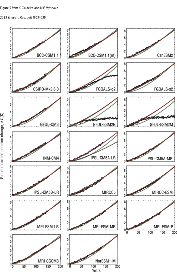
Caldeira and Myhrvold (2013) then extended this approach by fitting four different equation forms and evaluating best fits, via Akaike AIC and RMSE criteria. To do this they first used the Gregory ECS estimation method (ref at end) to define the temperature asymptote reached. They don’t give the details of their parameter estimation procedure, which must be some type of nonlinear optimization (and hence open to possible non-ML solutions), since the equation forms they tested were three (inverted) negative exponential forms and one other non-linear form (based on heat diffusion rates in the ocean). They also don’t provide any R^2 data indicating variance accounted for, but their figures (below) demonstrate that for all but one of their model forms (a one-parameter, inverted negative exponential) the fits are extremely good (and extremely similar) across most of the AOGCMs used in CMIP5:

Figure 2. Temperature results for CMIP5 models that have performed the abrupt4xCO2 simulations (black dots). Also shown are fits to this data using the functions described in the text: θ1-exp, green; θ2-exp, blue; θ3-exp, brown; θ1D, red. The left vertical axis shows the fraction of equilibrium temperature change (i.e., ΔT/ΔT4×); the right vertical axis indicates the absolute change in global mean temperature. Fit parameters are listed in SOM tables S3–S5 (available at stacks.iop.org/ERL/8/034039/mmedia).

Figure 2. Temperature results for CMIP5 models that have performed the abrupt4xCO2 simulations (black dots). Also shown are fits to this data using the functions described in the text: θ1-exp, green; θ2-exp, blue; θ3-exp, brown; θ1D, red. The left vertical axis shows the fraction of equilibrium temperature change (i.e., ΔT/ΔT4×); the right vertical axis indicates the absolute change in global mean temperature. Fit parameters are listed in SOM tables S3–S5 (available at stacks.iop.org/ERL/8/034039/mmedia).

Figure 5. Results from CMIP5 models (black dots) running simulations of the 1pctCO2 protocol. Projections made by simulations based on curve fits to the abrupt4xCO2 simulations as described in the text: θ1-exp, green; θ2-exp, blue; θ3-exp, brown; θ1D, red. All but θ1-exp provide similar approximations to the temperature results for most of the fully coupled, three-dimensional climate model simulations. Note that the GFDL-ESM2G and GFDL-ESM2M models did not continue with increasing atmospheric CO2 content after reaching twice the pre-industrial  concentration.

Figure 5. Results from CMIP5 models (black dots) running simulations of the 1pctCO2 protocol. Projections made by simulations based on curve fits to the abrupt4xCO2 simulations as described in the text: θ1-exp, green; θ2-exp, blue; θ3-exp, brown; θ1D, red. All but θ1-exp provide similar approximations to the temperature results for most of the fully coupled, three-dimensional climate model simulations. Note that the GFDL-ESM2G and GFDL-ESM2M models did not continue with increasing atmospheric CO2 content after reaching twice the preindustrial concentration.

So, both Good et al. (2011, 2012), and Caldeira et al. (2013) provide strong evidence that the physical processes involving surface temperature change, as encoded in AOGCMs, are likely very similar across extremely widely varying radiative forcing increases per unit time, from unrealistically huge, to (presumably) however small. Note that in both cases, a very large percentage (roughly, 40-60%) of the total temperature response (at equilibrium) occurs within the first decade (when normalized to the pulse magnitude). This seems to have implications for the importance of various feedbacks, an issue which is complicated by the fact that some of the models tested are Earth System Models, which include e.g. integrated carbon cycle feedbacks, while others do not. Certainly there will be major potential differences in carbon cycle feedbacks between an earth surface that has just increased 3 degrees C, instantly, versus one that has warmed only a tiny fraction of that amount.

TBC; the next post will demonstrate application to various delta RF scenarios.

Refs:

Caldeira and Myhrvold, (2013). Projections of the pace of warming following an abrupt increase in atmospheric carbon dioxide concentration. Environ. Res. Lett. 8: 034039, doi:10.1088/1748-9326/8/3/034039.
Good et al., (2011). A step‐response simple climate model to reconstruct and interpret AOGCM projections. GRL, 38, L01703, doi:10.1029/2010GL045208
Good et al., (2012). Abrupt CO2 experiments as tools for predicting and understanding CMIP5 representative concentration pathway projections. Climate Dynamics (2013) 40:1041–1053 DOI 10.1007/s00382-012-1410-4
Gregory et al., (2004) A new method for diagnosing radiative forcing and climate sensitivity. doi:10.1029/2003GL018747

See also: Hooss et al., (2001). A nonlinear impulse response model of the coupled carbon cycle-climate system (NICCS). Climate Dynamics 18.3-4: 189-202.

Transient temperature change estimation under varying radiative forcing change scenarios, part one

The estimation of transient climate sensitivity (TCS, defined below) has been in the back of my mind since writing a couple of posts a couple of months ago (here and here) on expected future global mean temperatures over this century. This post, and the one to follow, is thus a methods oriented post resulting from that thought process investigation. This one just introduces the basics of the problem and in the next one I’ll get into methods.

I use TCS here to refer to the realized, global mean, surface temperature change, at any given time point, resulting from a change in radiative forcing (RF) up to that point, regardless of whether either the thermal, or radiation, environments have re-equlibrated in response to this forcing change or not. It is a generalization of the transient climate response (TCR), which is defined as the expected mean surface temperature change at t = 70 years, of a 1% per year CO2 increase. Such a rate gives a CO2 doubling (1.01^69.66 = 2), and since CO2 RF is well-approximated by a logarithmic function of the CO2 concentration ratio at two time points, this results in a constant annual RF change rate (= 5.35 * ln(CO2.2/CO2.1)/70 = 0.053 W/m^2/yr). So, TCS is just a generalization of TCR, in that the time span needn’t be exactly 70 years, nor the forcing rate exactly 0.053 W/m^2/yr. Linear scaling, based on other delta RF rates, is allowed, but the reference time should be within, say, a couple decades or so of 70 years. In the CMIP5 climate model experiments, which form the input to the IPCC AR5 report, the 1% increase is extended over 140 years, reaching 4X CO2 (from pre-industrial), and the transient response at that point is simply divided by 2, to estimate TCR as just defined.

Although the concept itself is straight-forward, TCS estimation from empirical data is not, because of the several important time delays and/or feedbacks, not to mention forcing agents, in the climate system, for which the available data are not sufficient to this highly important task. Generally, global mean time series output for idealized, modeled RF scenarios is thus required, in particular the 1% per year, and instantaneous 400%, CMIP5 CO2 increase scenarios. For whatever reason, the annual time series output for these, and more importantly for the four more realistic Representative Concentration Pathway (RCP) scenarios analyzed, are rarely reported. Why this is so baffles me; it’s not hard and the AR5 seemingly should have done it, but whatever, I’m not in charge. To get them, one thus has to analyze each climate model’s raw output data. Finding these data, downloading them, aggregating them from native temporal and spatial scales to obtain yearly global means, etc., is a time-consuming process, and one requiring a fair bit of programming; it’s a lot of work. But useful and important work.

The equilibrium climate sensitivity (ECS) is the temperature change expected after this same RF increase (3.7 Watts/m^2, allowing for stratospheric/tropospheric adjustment) has been imposed, but only after both radiation and temperatures have reached equilibrium. What’s missing from most reported ECS estimates however, is the time scale over which the full temperature increase is realized. In a few cases, model-estimated ECS time scales have been determined by running models having lower spatio-temporal resolutions than typical AOGCMS, for one to five thousand years, to equilibrium. But that costs a lot of supercomputer computing time, and full resolution runs cost even more, so most often it is computed from shorter AOGCM model runs (~ 150 to 300 years). An important method for so doing involves linear regressions of delta T on the planetary, top-of-atmosphere radiative flux, extrapolated to the point where that flux is estimated to be zero: the so-called “Gregory method”, after it’s originator. ECS estimates vary, with the consensus central tendency value, for 35 years or more now, being estimated at around 3.0 degrees C, with a likely range between 1.5 and 4.5. But that issue is not the point of these posts.

But ECS, which while important, is not fully realized for several hundred years after the cessation of a RF increase, and why it should receive (typically) more attention than estimates for the next few decades, is another big puzzler (albeit one that CMIP5 addressed directly with its decadal forecasts). However, the main point of this post is that the idealized CMIP5 experiments mentioned above can be used to predict the annual time series of the expected warming for any imposed, realistic RF change, even though the idealized experiments are themselves decidedly unrealistic. An instantaneous 4X CO2 increase is obviously wildly unrealistic–nobody’s ever argued such a thing could actually happen short of some planetary natural disaster scenario. Even the 1% per year increase from pre-industrial for 70, or even 140, years is clearly too high; even from a 1950 baseline the mean annual CO2 increase has been only (400/310)^(1/64) = 1.004, or 0.4% per year. Only in the last couple decades has it exceeded 0.5% per year, although it’s certainly possible to hit 1% per year in the near future, from either a continuing increase in emission rates, decrease in aerosol production rates, strong carbon cycle feedback (or forcing, via land cover changes), or some combination of these. [Edit:referring to the equivalent RF here, not necessarily via CO2 increases.]

By any account, whether purely scientific or as policy input information, the estimated TCS for any given year, i.e. a time series, is an important thing to know, (of higher practical significance than is knowing ECS and/or it’s time scale, I would argue). I haven’t seen it commonly estimated however; in the IPCC AR5 report for example, just the TCR and ECS are reported, and decadal resolution estimates for the four RCP scenarios, in which several forcing agents are changing simultaneously, including various well-mixed greenhouse gases, non well-mixed atmospheric agents (e.g. aerosols, surface ozone), land cover, surface albedo, and sometimes other things.

TBC. Fire away if you have any comments/questions. I’ll do my best to answer the easy ones and dodge or obfuscate on the hard ones.

June US historical precipitation, a quick analysis

The NCDC June climate summary for the United States is out. June’s a real important month in the Northern Hemisphere, especially agriculturally. I’ll use these data as a chance to demonstrate the probability that June 2014 precipitation (P) in the US is drawn from a stationary distribution (over 1895-2014, 120 years, CONUS), using both state- and region-based P rankings, and 250k Monte Carlo simulations. [There are 97 years of record for Alaska, and Hawaii’s not included.] If precipitation is stationary over that time, we expect the state rankings (normalized to a 0-1 scale) not to differ significantly from 0.5. Easier still, although a slightly different question, is to evaluate the probability of having 9 states rank among their 10 wettest (as was observed), as then we only need that information, not the actual rankings of each state.

Below are the graphics showing the rankings (120 = wettest; Alaska, not shown, had the 2nd wettest June in its 97 year record):
June 2014 CONUS state-based P rankings
June 2014 CONUS region-based P rankings

One nice thing about this is that only a few lines of code are needed. Here it is for the first situation:

## 1. State-based. Probability that 9 (of 49) states' June 2014 precip ranks among the state's wettest.  Hawaii not included.
# Non-Alaska: 120 years in the NCDC record (1895-2014).  Alaska: 97 year record (1918-2014)
# 1=dryest, 120=wettest; all rankings normalized to 0-1 scale; test stat = 111/120 = .9175. 

rm(list=ls()); options(digits=3)
trials=250000; data=rep(NA,trials)
for (i in 1:trials) {z1=sample(seq(.001,1,.001),size=49,replace=F); data[i]=length(z1[z1 >= 111/120])}
(p = length(data[data>=9])/trials)

States are not all the same size, so we should normalize accordingly. A quicker approximation is just to use climate regions, which are more roughly equal in size than the states are. However, there are only ten of them, so it might be better to look at their central tendency and dispersion, rather than the number placing in the ten wettest years. [Of course, for both analyses, it would be even better to use the actual P values themselves, instead of their ranks, but with 120 years of data, this will be a good approximation of that].

## 2. Region-based. Probability that mean and std. dev. of regional (including AK) June 2014 precip ranks exceed expectation under hypothesis of stationarity (no change).  Hawaii not included.
regn.ranks = c(c(88,40,107,120,112,97,23,13,50)/120, 96/97)
par1=mean(regn.ranks); par2=sd(regn.ranks)
trials=250000; data=matrix(NA,nrow=trials,ncol=2)
for (i in 1:trials){
 z1=sample((1:1000)/1000,10,F)
 data[i,1]=mean(z1); data[i,2]=sd(z1)
 print(i)
}
p.mean = length(data[,1][data[,1]>=par1])/trials
p.sd = length(data[,2][data[,2]>=par2])/trials

OK, so the results then. The state-based analysis (top) returns a value of p = 0.009, or just under 1%, for the probability of having 9 states out of 49 rank in the top 10 of their historical records. The region-based analysis gives p = 0.063 for a stationary mean, and p = 0.098 for a stationary standard deviation, at the region level, thus neither quite reaching the standard p = .05 signficance level, but both getting there. Remember, p = 0.5 would be the expected value for each metric under a stationary June precipitation; values deviating therefrom, either way, indicating evidence for dynamics. Note also that this is not a trend analysis; for that you would need the time series of either the P values or the rankings for each state or region.

Global temperature change computations using transient sensitivity, part two

In a recent post I made some crude estimates of projected global mean surface temperature (GMST) change to year 2090, based on the estimates of transient climate response/sensitivity (TCR/TCS) values taken from the AR5. The numbers I got were at the very low end of the AR5 90% confidence intervals and I couldn’t understand why. As mentioned there, my working assumption was that my numbers were most likely the indefensible ones. And that does indeed appear to be exactly the case, and fortunately the discrepancy between my values and the AR5’s was not too hard to spot. So, this post is to explain the mistake I made and provide a little associated discussion.

The very short version is that I forgot to account for the temperature time delay(s) in the earth system whenever an increasing RF is imposed over a number of years. Stupid mistake, but good learning experience. As a quick review, I got these median and mean GMST values, using the means and medians respectively of the 52 TCR values given in AR5 WG1 (45 are from Chapter 9, Tables 9.5 and 9.6). I applied the standard RF linear pro-rating to account for differences in delta RF from a doubling, the latter being how TCR is defined. For total anthro (TA) forcings, using the midpoints of the AR5 time intervals, I got these numbers:

     Period   RCP dT.med dT.mean AR5.mid
1 1995-2090 rcp26  0.433   0.444     1.0
2 1995-2090 rcp45  1.145   1.176     1.8
3 1995-2090 rcp60  1.632   1.676     2.2
4 1995-2090 rcp85  2.726   2.799     3.7

Let’s call it ~2.75 deg C for the RCP 8.5 scenario, or almost a degree below the AR5 midpoint.

TCR is clearly defined–the GMST change expected from a 1% per year increase in RF CO2 (or an equivalent RF from all sources, CO2eq), once 2x RF CO2/CO2eq has been reached. A 1.0 percent increase always takes ~70 years to reach doubling [log(2, base=1.01)], so the time span–and hence the intensity–of the imposed RF change, is clearly defined. The longer it takes for a given increase in RF, the greater the T change by the end of the interval, relative to that at some future time beyond it (i.e., when equilibrium is reached). Due to ocean heating and large scale mixing, only some fraction of the RF-induced T effects can manifest in 70 years, which is why the Equilibrium Climate Senstivity (ECS) is always quite a bit higher than the TCR is. The AR5 reference time period midpoints (1995-2090, 95 years) give an interval just a little longer than the defined TCR 70 year period, not enough to matter hugely it would seem.

The lagged temperature increase in the system depends on several factors, but the AR4 (2007) best estimate was for an additional increase of 0.6 degrees C by year 2100. For the RCP 8.5 scenario, adding that value to 2.75 brings the estimate to 3.35, so now we’re definitely in the ball park just by that adjustment alone. But that 0.6 does not include any lagged response(s) that might originate in say the earlier decades of the 21st century but not be manifest until toward the end thereof. Trying to estimate that value requires a close look at the CMIP5 model outputs. I’ll look again in the AR5 for any such estimates (any help on the issue appreciated!), but it’s not hard at all to see that another 0.35 degrees, or more, could arise therefrom, giving a midpoint estimate of 3.7 degrees C, for the RCP 8.5.

The topics of time lags and slow feedbacks are very interesting ones IMO (in any field of science) and the fact that these are substantial in global T responses to rapid RF changes is of major importance. The fact that the mean/median TCR estimates declined between AR4 and AR5 is not necessarily a good thing, given that ECS estimates did not change much with them*. From a strict predictability perspective, forcing the system hard and fast is not a good thing, and you surely don’t want a big gap between TCR and ECS estimates, because it will tend to increase the difficulty of identifying and communicating cause and effect relationships. And since the scientific understanding on climate change and its attribution certainly affects policy, that’s not a good situation to be in.

* On reflection, one should also consider the fact that TCR estimates based on observational data have more confidence attached to them, than do ECS estimates from same, making the whole topic that much more intriguing.

Notes:
1. Edited several times for clarity.
2. The xkcd cartoon that spurred my original post is +/- unaffected by these considerations, i.e. still biased high, (but not by as much as I’d originally thought either). This is because that cartoon uses (presumably), the middle 20th century as its baseline point, and the lagged 0.6 degree C addition to the year 2100 T estimate, and whatever might be due to RF increases from 2000 to ~2030, are already +/- included in any estimate of T change from 1950 to 2100. Most GHG-induced warming is post-1950, when [CO2] was about 310 ppm.